The Background
Ever wondered why the number of people who respond to your Facebook posts varies based on the post? Have you ever gave it a thought that your friends’ list might run into thousands but the people who respond would most certainly be in hundreds. And, you wouldn’t have missed that there are a handful of people who respond to your posts regularly.
Same questions were running in my mind when I observed the number of friends who respond to my posts and my total friends count of 765.
Objective
Through this exercise, I wanted to analyse the response rate of my Facebook posts, reveal hidden facts and patterns. As this was a personal project, the final output was not planned at this stage.
The Challenge
I started by looking for settings on Facebook to download the response rate data for a given period of time. Unfortunately, Facebook doesn’t offer any. It became clear that it was going to be a daunting task to manually scan through each post and download their data.
Every post required a series of manual steps to be performed:
- Selecting and copying the friends who have responded for a post
- Pasting it to notepad to remove formatting
- Copying this data and pasting onto Excel
- Finding and removing any text other than friends’ name
- Sorting the names alphabetically
- Appending this list to Excel with date, month, post category and a short description to identify the post later.
Time to Sort Data and Filter
Once all the data from 100 posts were added to Excel, it was time to slice & dice the data. To better organise, I started grouping the data for each month.
While consolidating the monthly data, there was a duplication of names which were removed by using Remove Duplicates function in Excel. That resulted in a unique number of responses in a month. The number of posts in a month and their types were also consolidated.
When all the posts data were grouped as months, it was time to consolidate the entire data set. That exercise gave me fresh insights which were hidden till now. It also revealed that there were a few instances where friends had multiple Facebook profiles. Those duplications were corrected in the unique response list. Additionally, people who were not in my friend’s list and responded were also not counted in the total response count.
Fresh Insights Revealed
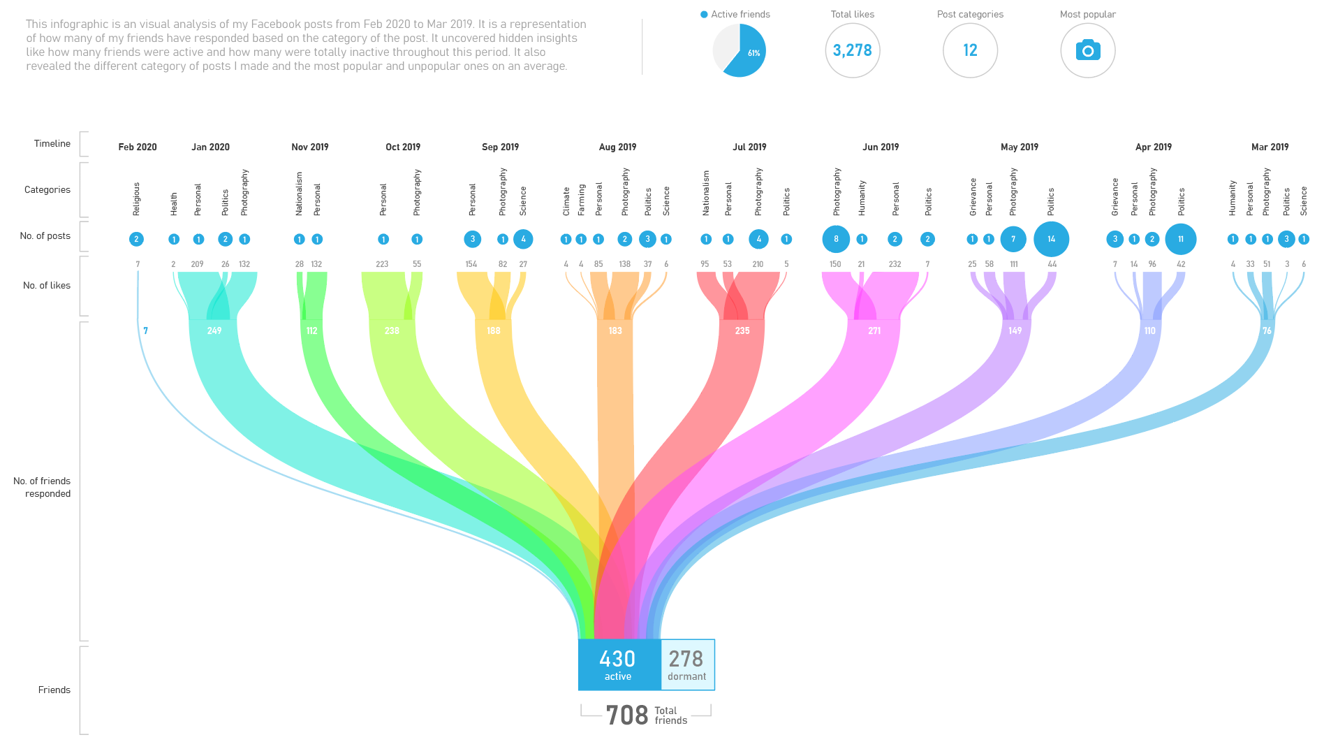
Looking at this formalised data, it was tempting to visualise it as a infographic. That would make the data more meaningful and intuitive.
Visualising Data
I started out with a few initial sketches and tried different visual means for representation.
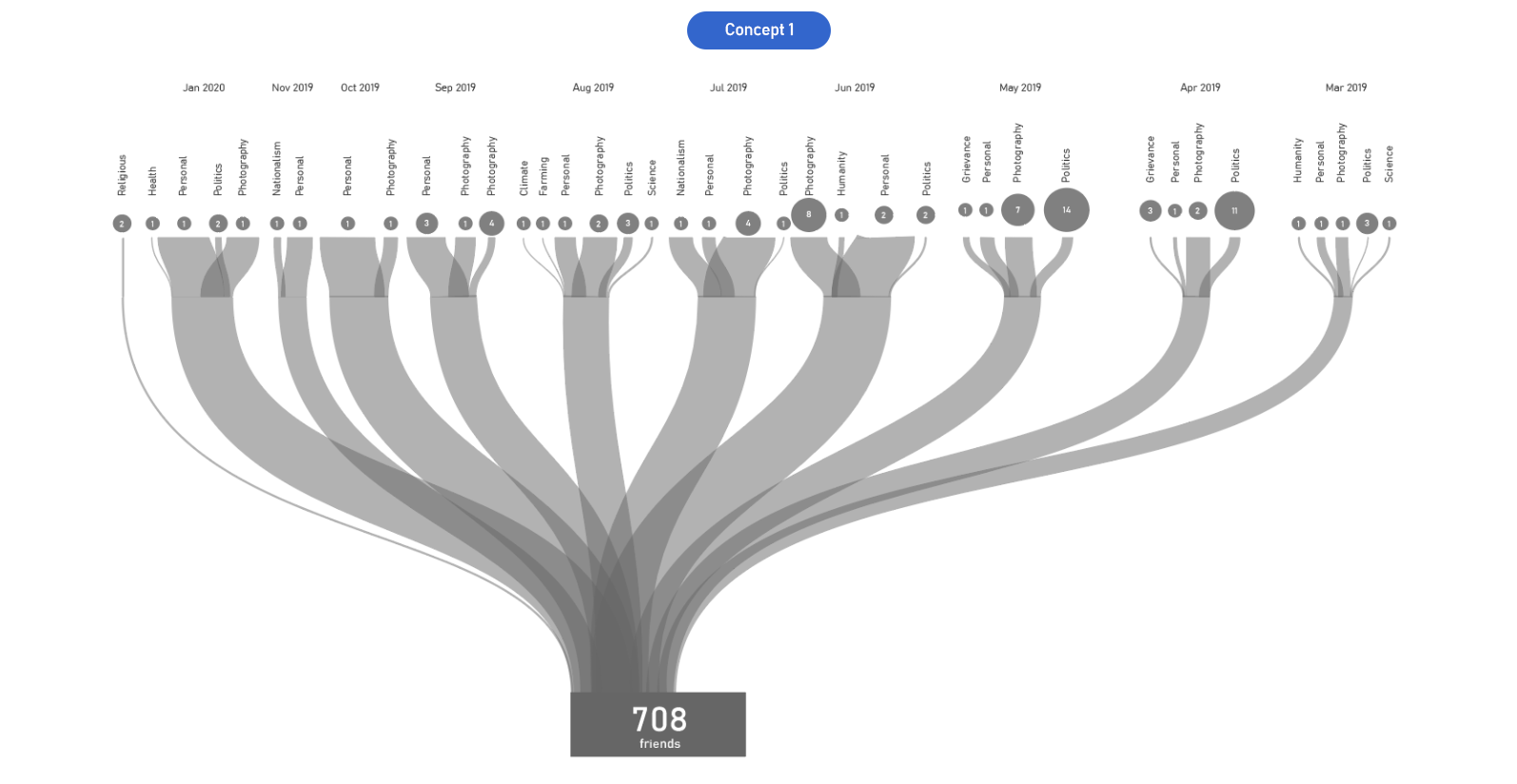
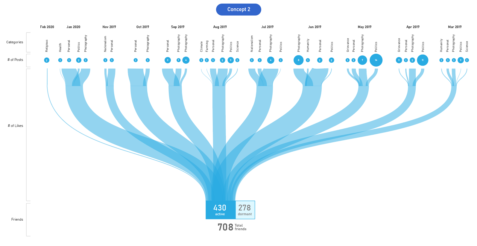
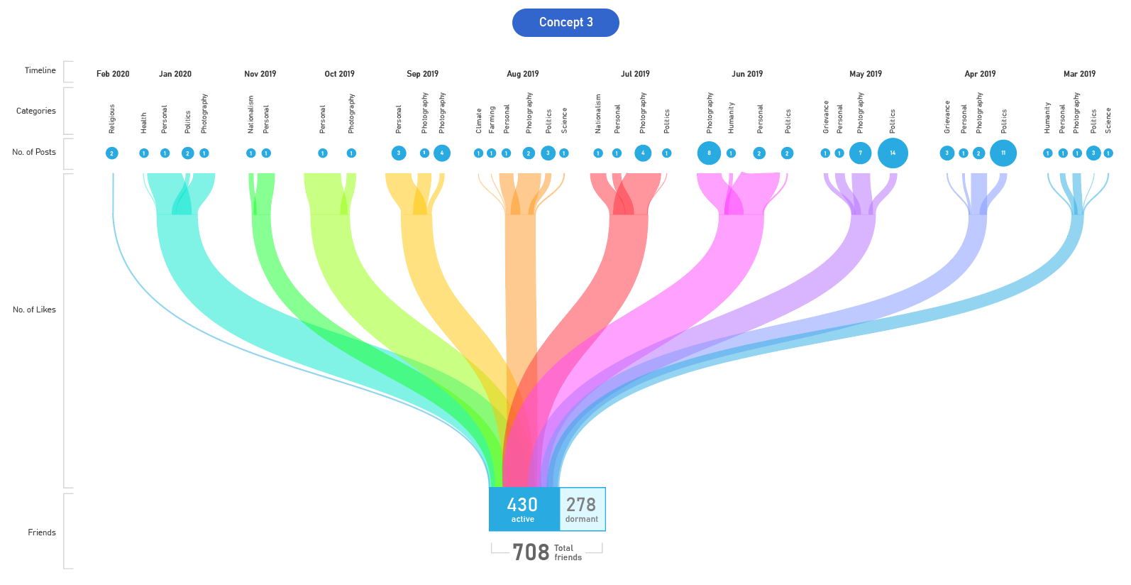
Design Iterations
I preferred the idea of using Sankey diagram to visualise the data.
Final Design
I completed my final design by adding an introduction and few additional insights at the top.
What I Learnt
I conceived this project while wondering about how my friends were responding to my Facebook posts. Initially, I did not have a clue to design such an infographic. But, while working with the data, it started revealing lots of hidden insights. That’s when I realised the idea of translating this raw data into an graphical representation so that it speaks for itself without explanation.
In this project, I learnt a few functions in Excel that helps in sorting, cleaning and filtering data. In Adobe Illustrator, I learnt how to draw smooth curves that can be easily edited.
Overall, it was a fun personal project.